
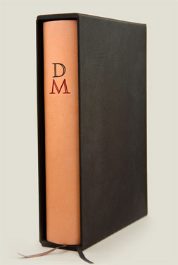
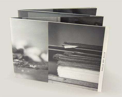
This is our book design of Dürr-i Meknûn (“The Hidden Pearl”), the 15e‑century cosmography by the dervish Ahmed Bican Yazıcıoğlu, considered of paramount importance for research into culture and language in early Ottoman times.
This book has been included in the collections of the university libraries of Harvard, Princeton, New York, Oxford, Bibliothèque Nationale Paris, Staatsbibliothek zu Berlin, and the Royal Library in The Hague.
Dürr-i Meknûn is a medieval work; opting for Nicolas Jenson’s (1420–1480) typeface was a logical decision. However, for this specific typeface, we designed several new characters. Some were practical additions, while others were conceptual (such as introducing a new symbol for ß in small caps).
The monogram on the cover, the title, and the chapter initials are set in Eyal’s typeface Kristal Open Caps, acclaimed by critics as “a fresh look at Renaissance designs”.
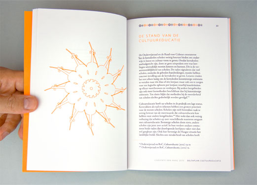
The typographic layout of Dürr-i Meknûn is intricately layered. While the primary text is in German, it includes numerous quotations from the source text in Ottoman script (read right-to‑left), alongside references from diverse scholarly literature in various other languages.
More information about the various aspects of this typography is available on Islamic Manuscripts.
The entire original Ottoman text of Dürr-i Meknûn is included in this edition, enabling readers to witness and understand firsthand how transcription errors and interpretative discrepancies could have emerged in the manuscript tradition over the centuries.
This edition introduces the application of Winsoft Tasmeem, the first digital typeface that authentically replicated the handwritten essence of Ottoman script.
“Functional, yet individualistic and eccentric... a masterful and courageous design”
Jan Middendorp, Designcriticus bij EYE Magazine
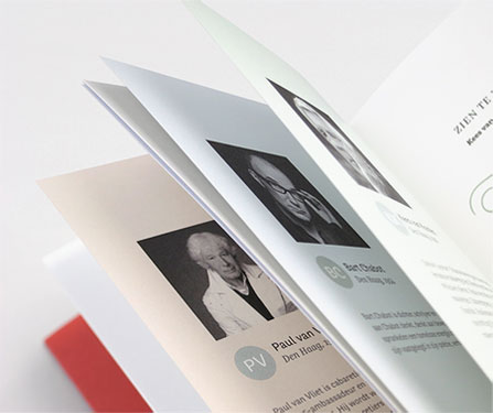
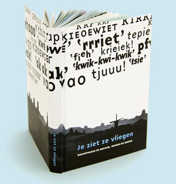
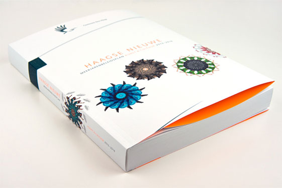
More book designs


Other projects


Studio Eyal & Myrthe
Van Boisotstraat 1
2581 RT The Hague
The Netherlands
+31 70-7505863
+31 6-19095460


We use the General Terms and Conditions of the Association of Dutch Designers (BNO).
These can be read in this PDF.
Chamber of Commerce 27311580
VAT NL8189.22.722.B01
 Portfolio